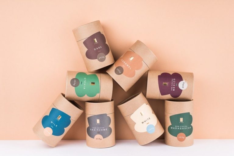
The professional and unique visual identity of a company, whether small, medium or large one, makes a big difference in its success and performance. A well-made corporate identity enhances the credibility and quality of the services the company offers and leads to increased demand and sales.
The packaging is one of the most dynamic and changing disciplines in the universe of graphic design. Boxes are the utmost importance when it comes to consumer purchase decisions, which requires brands to permanently surprise their customers filling the shelves of the points of sale with some breathtaking or gripping appearance.
Following that, here we have some latest movements regarding this branch that were developed and implemented.
1. Recyclable Packaging
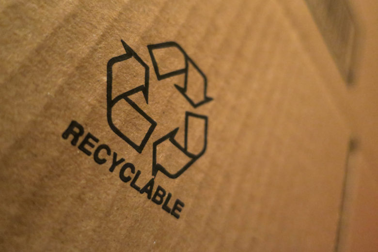
In the first place, for this method, ie. this type of packaging we couldn’t really say that it belongs to the latest technology since recycling has been around for a long time now and is gaining more support everywhere with each passing day. Until a few years ago, packaging was considered one of the main sources of garbage. Thanks to ideas such as smart emballage that extends the shelf life of food, awareness of the environment is growing.
Also, if you prefer to preserve the environment without having to give up the attractive gift wrap for your loved ones, this is a great way to do it. Cardboard boxes without styrofoam, adhesive tape, plastic, glitter and cellophane, brown cardboard and paper bags are completely recyclable. Having this in mind, with a few changes, you can always make a unique and interesting wrapping material to accompany your present.
2. Custom printed boxes
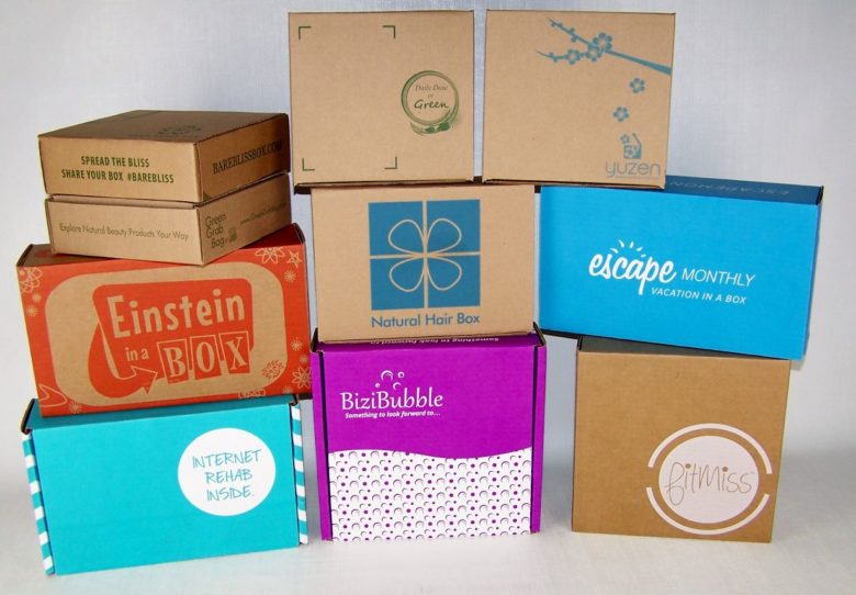
Everybody loves personalized and custom made items and gifts. Here’s the thing: it shows that someone notices and cares about those little things that characterize us and makes us distinctive. That’s why custom printed packages went through a great expansion lately – you’re able to make anything out of a simple box.
If you’re running your own business and producing and selling your own goods, a nice and enthralling wrapping could represent a lovely detail. But it needs to show exactly what you are. Item personalization, as well as a personal message or logo, is something that helps build stronger relationships with online customers, enhancing their overall experience. Companies like IMColorPrint have much to offer regarding this since their major concern is the satisfaction of their buyers and not only the sale – you can view more here.
3. Minimalism
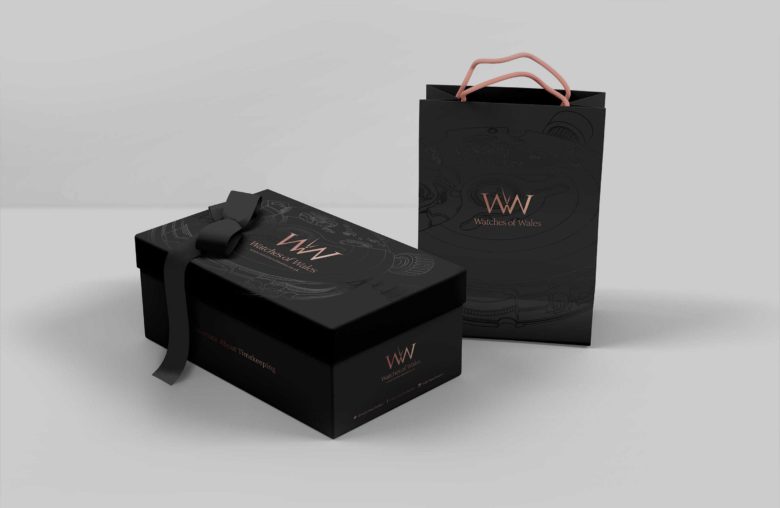
Less is more. Another thing that has garnered much praise for its clarity and effectiveness. It truly picks up the pace and catches the attention of most brands that need an interesting wrapping concept to sell their own products. A growing number of large trademarks are restricting the use of small typography and long text.
So, why minimalism? Well, it’s elegant, without unnecessary additional details, mostly uses one or two colors and the focus doesn’t move from the essentials by some graphic details. The human mind hates working too much: it’s an organ that’s supposed to save energy, not waste it.
If a manufacturer can summarize all its values in a single sentence, the resulting simplicity will imply transparency. Clearly, consumer attention has diminished, and so it becomes more important today than ever before for brands to send their message clearly and loudly.
This could easily reward the brand with greater buyer confidence since it’s noticeable that it provides us with value without having to analyze many variables. Technology helps here by providing high quality and outstanding materials of which the boxes are made.
4. Retro or vintage
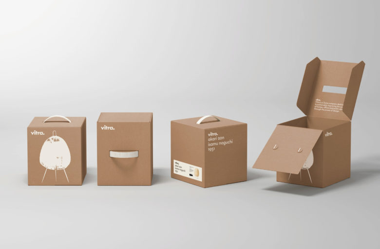
To make an innovative and modern concept, brands must constantly be aware of changes in styles in the industry and always be aware of new movements. If they don’t keep up with the competition, they tend to lose the market niche. And this will seriously affect their sales.
However, there is another alternative that contains both innovation and old-school nuances – the creation of an emballage with a deliberately retro manufacturing strategy.
This has proven popular in recent years, particularly with food and beverage. How come? It’s quite simple: consumers just can’t help remembering their past, which provokes an emotional response, thus increasing the chance to remember the items later thanks to the improved experience. Brands give buyers insight into the artisanal quality of their products and that’s exactly what helps them stand out from the crowd in an era, the digital one, in which everything seems to be mass-produced.
And if it works like this with famous trademarks, it’ll do some magic with your idea as well. Just try to remember all those old good things that everyone’s nostalgic about and connect them with your conceptualization. It could work great with food, drinks, clothes, toys and many more aspects.
5. Photography
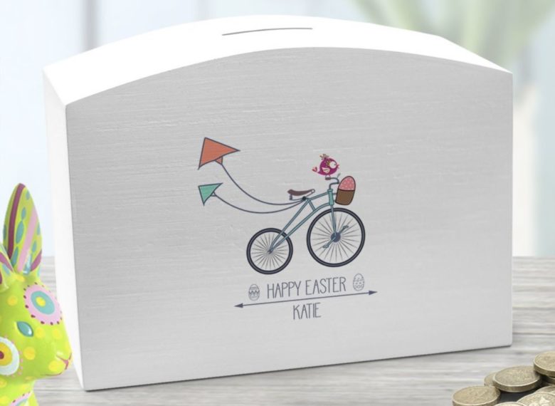
Another great concept that has particularly caught attention lately has been the use of photography or an illustration in the packaging sector. An image is worth a thousand words – and the photograph printed on the emballage helps greatly to sell things.
This happens because photography establishes a more personal connection with the consumer by linking the item to a specific face, place or element. In addition to all this, it will give your goods a breath of modernity. Used wisely, photography helps products (particularly the most photogenic ones) to be sold thanks to virtual attractiveness.
6. Bright Materials with Holographic Effects and Gradients
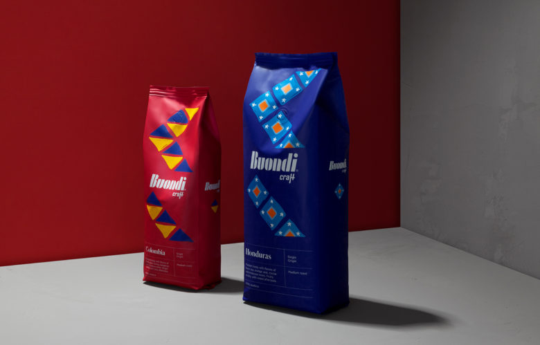
Materials with holographic touch add a special shine to almost any container, even those that are particularly bland and not that interesting
After an era dominated by the “flat design“, bright gradients (the transition from one color to another) will also bring a revival and add some more complexity and fun. And one thing is for sure – this kind of striking scheme will keep being a trend since flat design gives depth, dimensionality and modernity to the concept.
7. Neutral palettes
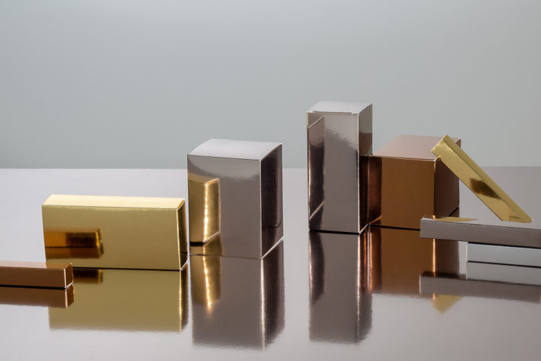
When it comes to the neutral palette, most will only think of beige and nothing else – but not the ones who conceptualize. They’ll mix everything – from pale pink and apricot to powder, and will also incorporate a chocolate or cream hue to spice up the whole specter. These neutral colors are a real hit, not just in packing, but also in fashion and other branches.
This specter is used to achieve a delicate and eye-catching effect that will give consumers a comfortable sense of serenity. This trend, in addition to gentle neutral shades, also incorporates classic pastel tones into the scheme…
In addition to neutral shades, it’s essential to flush out the complete depiction in the same style and add labels in neutral shades (for example white) that will only blend with the entire composition.
All these trends in product packaging design reflect artistic and cultural styles that are becoming larger and larger. The tastes regarding patterns are much more changing than before.
Whether you find minimalism interesting and consider it to be your biggest creative challenge, or you are a fan of vibrant colors and an authentic attention-grabbing trend that you would like your customers to see combined with other trends coming up, these suggestions could make your choice easier.

